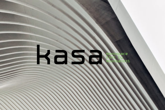
Kasa: A Futuristic Display Font for Digital Branding
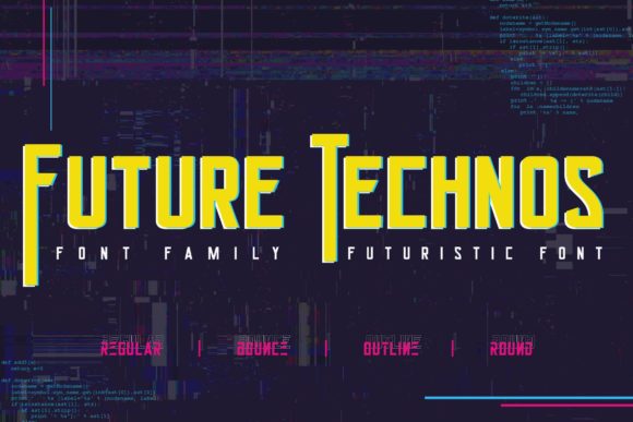
As a UI designer who ships landing pages, SaaS dashboards, and conversion-optimized e-commerce experiences, I treat typography like interface logic—not decoration. That’s why Kasa stands out: it’s a modern display font engineered for impact without sacrificing clarity in digital contexts. Its clean geometry, subtle terminal flares, and balanced proportions make it feel both forward-looking and legible at scale—especially where visual hierarchy matters most.
Kasa isn’t built for body text. It’s designed to command attention: in hero section headlines, app onboarding screens, product feature cards, and branded banners. Its letterforms carry quiet confidence—neither coldly technical nor overly playful—making it ideal for creative studios, boutique online stores, wellness coaches, and B2B SaaS brands aiming for sophistication with approachability.
Where Kasa Delivers Real Web Design Value
In practice, Kasa shines where first impressions drive decisions. On a course sales page, pairing Kasa with a neutral sans serif like Inter or Manrope for body copy instantly signals premium positioning. The contrast between Kasa’s structured elegance and the functional readability of the supporting typeface guides the eye toward key benefits and CTAs—without visual noise.
For portfolio websites, Kasa works exceptionally well in project titles overlaid on full-bleed imagery. Its open counters and generous x-height ensure legibility even over textured or gradient backgrounds—critical for mobile-first layouts where contrast and spacing are non-negotiable. On dark mode interfaces, its crisp stroke endings prevent blurring, and its consistent weight distribution avoids “floating” letters common in overly stylized display fonts.
It’s also highly effective in micro-interactions: animated hover states on buttons using Kasa (at 24–32px) create memorable moments without slowing load times—especially when served as a lightweight WOFF2 webfont. Just avoid scaling it below 20px on buttons or navigation labels; its design intent is expressive presence, not compact utility.
Readability & Responsiveness: Practical Guidelines
Kasa performs reliably across devices—but only when used intentionally. On mobile, reserve it for top-level headings (H1, H2), hero subheads, or section dividers. Never use it for paragraph text, form labels, or small tab indicators. Its character width and spacing are optimized for scanning, not sustained reading.
When layered over images or video backgrounds, test contrast ratios rigorously. Kasa’s medium weight holds up best against mid-tone overlays; for light-on-dark or dark-on-light combinations, stick to its default weight rather than thin or black variants unless explicitly designed for those extremes. Also verify that your webfont implementation includes fallbacks—many designers overlook that Kasa’s stylistic alternates (like rounded terminals or extended ascenders) require explicit OpenType feature activation via CSS font-feature-settings.
Smart Pairing for Cohesive Digital Identity
Kasa thrives in contrast. Pair it with a humanist sans serif—such as Poppins, Lato, or Work Sans—for UI text, blog posts, and product descriptions. These fonts provide rhythm, neutrality, and accessibility compliance while letting Kasa anchor tone and brand voice. For editorial-style digital experiences (think newsletters, knowledge bases, or content-rich SaaS docs), consider a low-contrast serif like Cormorant Garamond or Literata as secondary text—creating depth without competing for dominance.
Avoid pairing Kasa with other display fonts, script fonts, or decorative serifs. Its personality is distinct enough to stand alone in headline roles, and cluttering the typographic palette dilutes its strategic impact. In brand kits, treat Kasa as your primary expression of voice—then let supporting fonts handle function.
Licensing, Formats & Real-World Deployment
Kasa ships as a complete display font family with multiple weights (Light, Regular, Medium, Bold), true italics, and extended Latin language support—including accented characters for Spanish, French, German, and Portuguese. It’s available in WOFF2, WOFF, and TTF formats, making it production-ready for modern web stacks. Most licensing options cover commercial use across client websites, online stores, digital templates, and SaaS applications—just confirm whether your plan includes unlimited domains or requires per-project validation.
If you’re building reusable design systems or selling Figma templates, verify that your license permits redistribution. Some premium font vendors restrict embedding in editable assets—so always review the EULA before packaging Kasa into theme files or Notion workspace kits.
Use Cases That Prove Its Versatility
- Creative portfolios: Use Kasa for project titles and category headers—its uniform stroke weight ensures consistency across grid-based layouts.
- Boutique e-commerce: Apply it to collection banners and limited-edition launch announcements—its restrained futurism elevates perceived value without alienating broad audiences.
- Coaching & course sites: Deploy Kasa in hero headlines and module titles to signal transformation and clarity—key emotional triggers for high-intent learners.
- SaaS landing pages: Leverage its clean geometry in feature section headers to imply precision, reliability, and thoughtful design.
- Brand identity systems: Use Kasa in logo lockups, social media banners, and email headers to unify visual tone across touchpoints—especially when paired with a single supporting font family.
Ultimately, Kasa isn’t about trend-chasing—it’s about intentionality. It gives digital creators a tool that communicates brand maturity while adapting cleanly to responsive constraints, accessibility requirements, and performance budgets. When every pixel serves purpose, typography becomes infrastructure. And in that context, Kasa doesn’t just look futuristic—it functions like it.